How a Healthcare Data Company Gets a Full Analytics Dashboard Without an Analyst
How a Healthcare Data Company Gets a Full Analytics Dashboard Without an Analyst
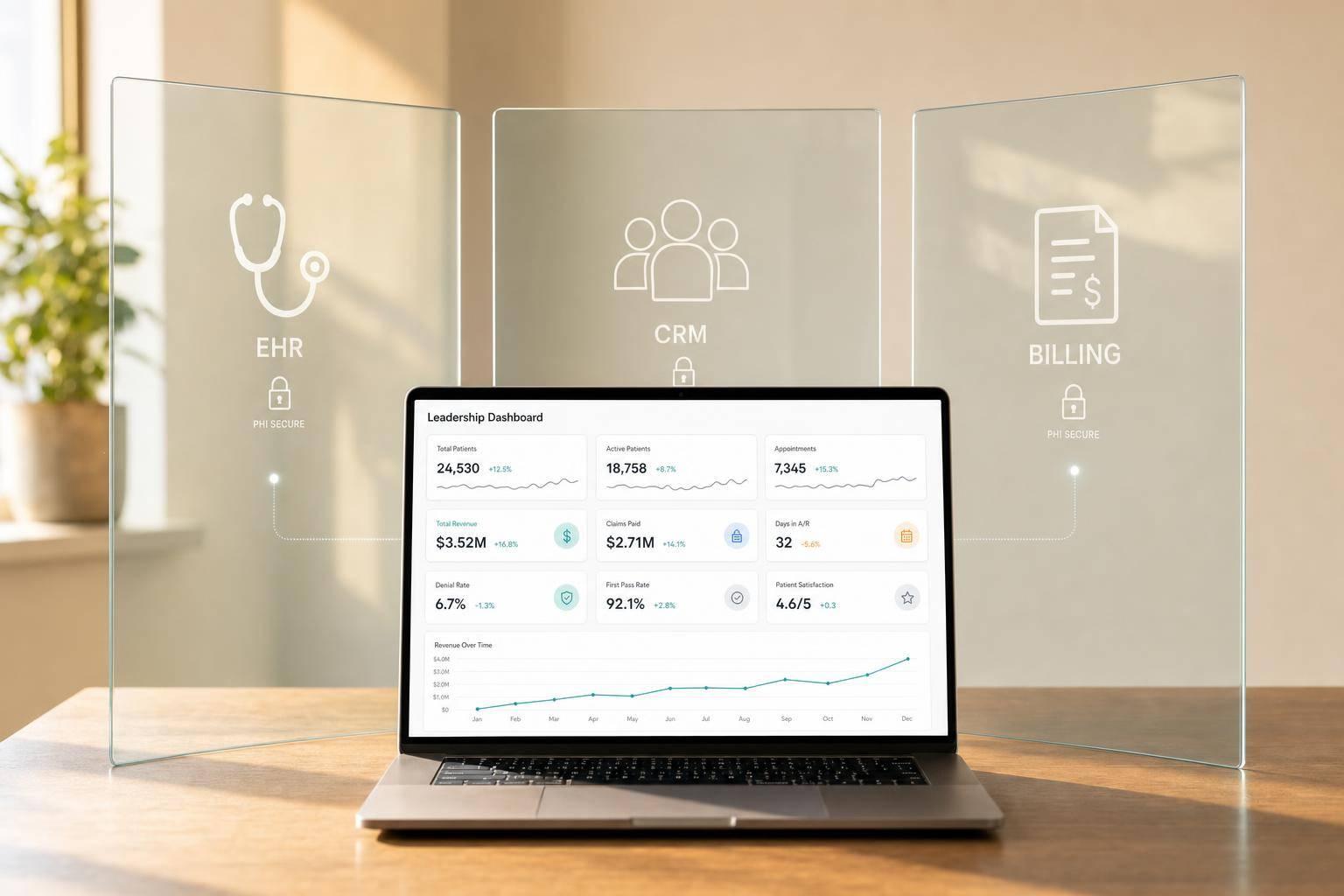
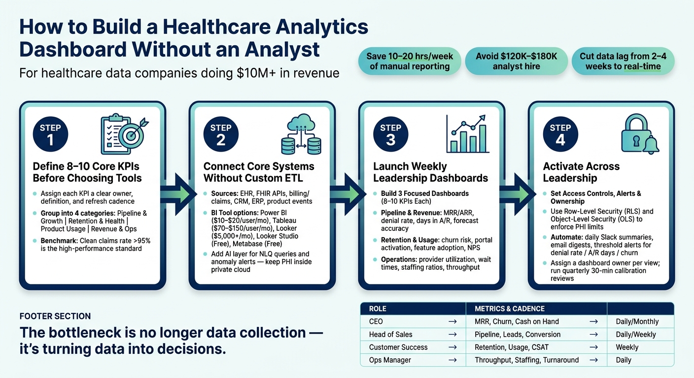
You do not need a hired analyst to get leadership dashboards live. If your healthcare data company is doing $10 million+ in revenue, you can set up a BI stack that pulls from 10 to 15 systems, updates key metrics on a schedule, and cuts 10 to 20 hours a week of manual reporting work.
Here’s the short version:
- I’d start with 8 to 10 KPIs, not a tool
- I’d map each KPI to a team owner and access level
- I’d connect core systems like EHR, billing, claims, CRM, and product data
- I’d use one BI tool for internal reporting, then add AI for summaries and alerts
- I’d give leaders role-based views with limited PHI exposure
- I’d set threshold alerts for metrics like denial rate, A/R days, churn, and pipeline coverage
The main point is simple: the bottleneck is no longer data collection. It’s turning that data into reports people can use every day without spreadsheet handoffs, stale numbers, or constant SQL work.
A setup like this helps replace old reporting with one shared system for revenue, retention, usage, and team performance. It also helps avoid the cost and delay of hiring an analyst, which the article puts at $120,000 to $180,000 per year and 3 to 6 months before that person is fully ramped.
If I were summarizing the article in one line, it would be this: define the KPIs first, connect only the systems that feed them, build a small set of weekly dashboards, and lock in access, alerts, and ownership from day one.
How to Build a Healthcare Analytics Dashboard Without an Analyst
Power BI Dashboard for Healthcare Analytics: Full Tutorial | How to use Power BI Desktop
sbb-itb-9cd970b
Step 1: Define Your Healthcare KPIs and Dashboard Use Cases Before Choosing Tools
Start with the KPIs. Pick the tool after that.
If you do it the other way around, you usually end up with more charts, more noise, and the same old analyst scramble. The goal here isn’t to track every number you can find. It’s to create one shared system that replaces ad hoc reporting.
A good starting point is 8 to 10 core KPIs. Each metric should have:
- a clear owner
- a plain-language definition
- a refresh cadence tied to how fast decisions need to happen
Once that list is set, choosing a BI tool gets a lot easier.
The Four KPI Groups That Matter Most
These four groups cover the revenue, retention, usage, and operations data most healthcare businesses need to review every week.
| KPI Group | Concrete Examples | Typical Owner |
|---|---|---|
| Pipeline & Growth | Referral source attribution, new patient acquisition, marketing ROI, visit volume trends | Head of Sales / Marketing |
| Customer Retention & Health | Patient satisfaction (NPS/CAHPS), portal activation rate, patient retention rate | Customer Success Lead |
| Product Usage & Engagement | Feature adoption, provider utilization, export volume | Product Leadership |
| Revenue & Operational Performance | Net Collection Rate (NCR), Days in Accounts Receivable (AR), denial rates, revenue per visit | CFO / Operations Manager |
If you’re tracking revenue and operations, pay close attention to claims performance. A clean claims rate above 95% is the benchmark for high-performing healthcare revenue cycles [8]. When denial rates tick up or AR days start climbing, the dashboard should flag it fast.
These four groups give you the base for the dashboard stack in the next step.
Which Teams Need Which Views
Every team does not need the same dashboard view. In healthcare, that also means planning for PHI minimization from day one. Limit PHI early so leadership can see what they need without adding compliance exposure.
| Role | Primary Metrics | Access Level |
|---|---|---|
| CEO / Leadership | Revenue trends, EBITDA, cash flow, market share | Aggregated, no PHI |
| Head of Sales / Marketing | Referral source attribution, new patient acquisition, marketing ROI | Financial, no PHI |
| Customer Success Lead | Patient satisfaction (NPS/CAHPS), portal activation rate, patient retention rate | Aggregated, no PHI |
| Operations Manager | Net Collection Rate, Days in AR, denial rates, staffing ratios | Operational, limited PHI |
| Compliance Officer | Unusual access patterns, break-glass events [8] | Audit only |
Use Row-Level Security (RLS) and Object-Level Security (OLS) to enforce those boundaries [10][7]. Set that up at the definition stage, not after the dashboards are live. Bolting security on later is a headache, and it usually creates gaps.
This step cuts down analyst-led debates over metric definitions and gives everyone one shared measurement framework. Map each KPI to the right role now, or teams will drift into shadow reporting and start using different versions of the same metric.
With KPI definitions locked, the next step is picking the smallest BI stack that can deliver them in a dependable way.
Step 2: Build a Minimum Viable Analytics Stack With SaaS BI and Automated Data Connections
Now that your KPIs are set, the next step is to connect your data sources to a BI tool without building custom pipelines. Keep it simple at first: connect only the systems that feed those KPIs.
Connect Your Core Healthcare and Go-to-Market Data Sources
Start with the systems tied to your main KPIs: EHR data, FHIR APIs, billing and claims, CRM, ERP, and product event streams [1][5][6].
A lot of BI tools come with native connectors for these sources, which means you can skip custom ETL work. For most dashboards, a daily refresh is enough. Save direct query for metrics that need near-real-time updates [13][2]. If you're connecting to an EHR reporting database like Epic Clarity, use a read-only SQL account so you don't put data integrity at risk [1][3].
Pick a Primary BI Tool for Internal Reporting
Your BI pick usually comes down to three things: how technical your team is, where the data sits, and how advanced the dashboards need to be. Here's a practical side-by-side view:
| Tool | Best For | Ease of Use | Healthcare Use Case | Estimated Cost (USD) |
|---|---|---|---|---|
| Power BI | Microsoft-centric teams | Moderate; DAX has a learning curve | MedTech and healthcare dashboards; deep Excel and Azure integration | $10–$20/user/mo [2] |
| Tableau | High-end visualization | Steep for complex analysis | Executive-level clinical dashboards | $70–$150/user/mo [2] |
| Looker | Modern data warehouses | Technical; LookML required | Centralizing metrics across large systems | $5,000+/mo (team) [2] |
| Looker Studio | Startups and small teams | High; drag-and-drop | Quick tracking of ad spend, CAC, and basic CRM data | Free [3][2] |
| Metabase | Technical founders | Moderate; self-hosted free tier | Basic internal SQL querying | Free (open source) [1] |
For many healthcare data companies without a dedicated analyst, Power BI is the practical default if you're already using Microsoft tools. It connects cleanly to NetSuite, SQL databases, and Azure. Its semantic model also helps you define metrics like revenue or churn once, so every report pulls from the same logic [13][6].
Use AI Reporting Layers to Cut Manual Analysis Work
Use NLQ for ad hoc questions and anomaly detection for automatic KPI alerts [1][4][11].
If a dashboard includes PHI, keep the AI layer inside your private cloud or on-premises setup. Do not send PHI to an external LLM API [4][5].
| Feature | Built-in BI AI (e.g., Power BI or Tableau) | Standalone AI Layers (e.g., Knowi) |
|---|---|---|
| Primary Use Case | Enhancing existing charts; simple NLQ | Natural language querying of raw data from scratch |
| Compliance | Cloud-dependent | Often supports Private AI (on-prem or VPC) |
| Reporting Output | Visual suggestions, trend lines, summaries | Direct answers, SQL generation, and alerts [1][4][11] |
AI tools can handle most routine analyst work [1]. That doesn't replace judgment. It replaces the repetitive stuff: pulling numbers, formatting slides, and flagging obvious outliers. Your team still decides what the numbers mean. The tool does the heavy lifting.
With the stack connected, build the weekly dashboards leadership will use.
Step 3: Launch the Core Dashboards Your Team Will Use Every Week
Once your stack is connected, the next move is simple: build the dashboards your team will check every single week.
Keep each one focused on 8–10 live KPIs [12]. That limit matters. If a dashboard tries to do too much, people stop using it. Each dashboard should take the place of one weekly reporting job your team used to pull together by hand.
The goal here isn't more charts. It's giving leadership a small set of views they can trust and act on.
Pipeline and Revenue Dashboards
Start with two core dashboards:
- A pipeline dashboard for lead volume, stage progression, and deal velocity
- A revenue dashboard for MRR/ARR, days in A/R, collection rate, denial rate, and forecast accuracy
This setup gives Sales and Finance a clean read on what's moving and what's getting stuck.
A spike in claim denial rate isn't just a billing issue. It's often a cash flow problem before it hits your bank account. That's why this dashboard needs to stay live, not buried in a monthly report.
If you're using Power BI, the "Explain the Increase/Decrease" feature can help your team see which payer, service line, or procedure code drove a change without manual drill-down [12]. That saves time and makes it easier to move from "something changed" to "here's why."
From there, build the retention view that shows which accounts need attention before churn shows up.
Customer Retention, Product Usage, and Operational KPI Dashboards
Customer Success needs one retention dashboard that puts risk in plain sight. Pull together renewal status, churn risk, logins, and feature adoption in one place so CS and Product can spot trouble early.
Then add referral leakage and patient satisfaction scores. That makes it easier to see where value is slipping and which accounts are losing usage before renewal hits.
On the operations side, build a dashboard around provider output, utilization, wait times, no-shows, and staffing gaps. This gives your ops team a live view of capacity, staffing, and throughput without asking someone to compile numbers every week. Automated operational dashboards can reduce wait times and increase capacity [9].
Use this ownership map to keep every dashboard tied to a team and a decision:
| Dashboard | Primary Team | Key Decisions Supported |
|---|---|---|
| Pipeline / Revenue | Sales, Finance | Spotting sales slowdowns; improving forecast accuracy; identifying revenue leakage |
| Retention / Usage | Customer Success, Product | Identifying at-risk accounts; prioritizing product updates; improving patient experience |
| Operations | Operations, Clinical | Optimizing scheduling; reducing overtime; managing capacity surges |
Next, give each team access to the right view and automate alerts so the dashboards stay useful.
Step 4: Put the Dashboards to Work Across Your Leadership Team
With your core dashboards live, the last move is simple: make them part of how leadership works every day.
Set Up Role-Based Access, Alerts, and Executive Reporting
After the dashboards are built, get them in front of the right people with the right permissions. Use RLS to filter data by user role and OLS to hide sensitive fields [7][10].
Then plug those dashboards into the tools your team already uses. Send daily Slack summaries, scheduled email digests, and embed dashboards in internal wikis. A simple rhythm works well: a daily check, a Monday review, and a monthly deep dive. Give most stakeholders read-only access so they can use filters without changing anything.
For your highest-risk KPIs, set threshold alerts. If pipeline coverage drops or A/R over 60 days rises, send an alert to Slack or email right away [1][15].
Once access and alerts are in place, the next job is keeping the numbers clean so people keep trusting what they see.
Keep Data Accurate and Grow the System Over Time
Dashboard use lives or dies on fresh, steady numbers. Handle cleaning and aggregation in SQL views, not BI calculated fields. That keeps dashboards fast and makes sure every team uses the same definition of churn or active user [14][1]. Day-to-day upkeep should stay focused on refresh ownership, alert thresholds, and source validation, not on arguing over metric definitions again and again [14][1][15].
Assign a dashboard owner to each view. That can be an Ops Lead or Product Manager who checks sources and updates alert thresholds each month to keep the dashboards reliable [1][15]. It also helps to run a 30-minute calibration review each quarter to make sure KPI ranges and briefing formats still match the business [15].
Here’s what that operating rhythm can look like across the leadership team:
| Role | Alerts and Reports Received | Frequency | Key Decisions Driven |
|---|---|---|---|
| CEO | MRR, Churn Rate, Cash on Hand | Daily / Monthly | Resource allocation, fundraising, high-level strategy |
| Head of Sales | Pipeline Value, New Leads, Conversion Rate | Daily / Weekly | Sales coaching, adjusting outreach, forecasting |
| Customer Success Lead | Retention Rate, Product Usage, CSAT | Weekly | Identifying at-risk accounts, feature prioritization |
| Operations Manager | Throughput, Staffing Ratios, Turnaround Time | Daily | Shift adjustments, bottleneck removal, capacity planning |
As your data grows, there’s a point where spreadsheets start to crack. When datasets outgrow them, move to BigQuery or Snowflake [14][1].
Conclusion: The Fastest Path to a Full Analytics Dashboard Without an Analyst
With permissions, alerts, and ownership locked in, the system can run with very little manual work.
Use this sequence:
- Define KPIs
- Connect systems
- Choose BI
- Add AI reporting
- Apply access controls
- Automate alerts
Manual reporting in healthcare often takes 10–20 hours per week and gives leaders data that is already 2–4 weeks old by the time they see it [2]. This stack fixes both issues.
What you get is integrated reporting, faster decisions, and executive-ready visibility.
FAQs
How long does setup usually take?
Setup time comes down to two things: how messy your data is and which tools you're using. That said, modern AI-powered solutions can shrink the timeline from weeks or months to just hours.
A simple dashboard with a handful of key metrics can often go live in 30 to 60 minutes. A more complete dashboard that pulls from multiple data sources usually takes 1 to 2 days, with most of that time spent on data validation.
And in some cases, specialized AI agents can deploy production-ready dashboards in 4 to 7 minutes.
What data should we connect first?
Start by listing the systems you use today, like EHR databases, billing platforms, CRMs, and spreadsheets. In most cases, it makes sense to connect your main operating database first, such as Postgres, MySQL, or your core EHR/ERP system, because that’s usually where your day-to-day performance data lives.
If you want to get moving fast, a clean Google Sheet or CSV with your KPIs can work well too. Whichever path you take, connect one data source at a time so you can check accuracy before you add more.
How do we keep PHI secure in dashboards?
Keep PHI secure with a layered approach. Start with a Business Associate Agreement (BAA) because no dashboard tool is HIPAA-compliant out of the box.
From there, put the main safeguards in place: access controls like RBAC and RLS, encryption at rest and in transit, audit logging, and PHI masking or aggregation to meet the Minimum Necessary Rule.
It also helps to run regular risk analyses and train your team. That cuts down on simple but costly mistakes, like accidental exports or sharing settings that were set up the wrong way.