
The Leaders Who Don't Understand Data Distribution Won't Survive 2026
Data distribution is no longer optional knowledge for leaders - it's a survival skill. Averages alone can't guide decisions in today's complex, AI-driven landscape. Misunderstanding the spread, skew, or drift in data can lead to flawed predictions, wasted resources, and failed AI projects. Here's what you need to know:
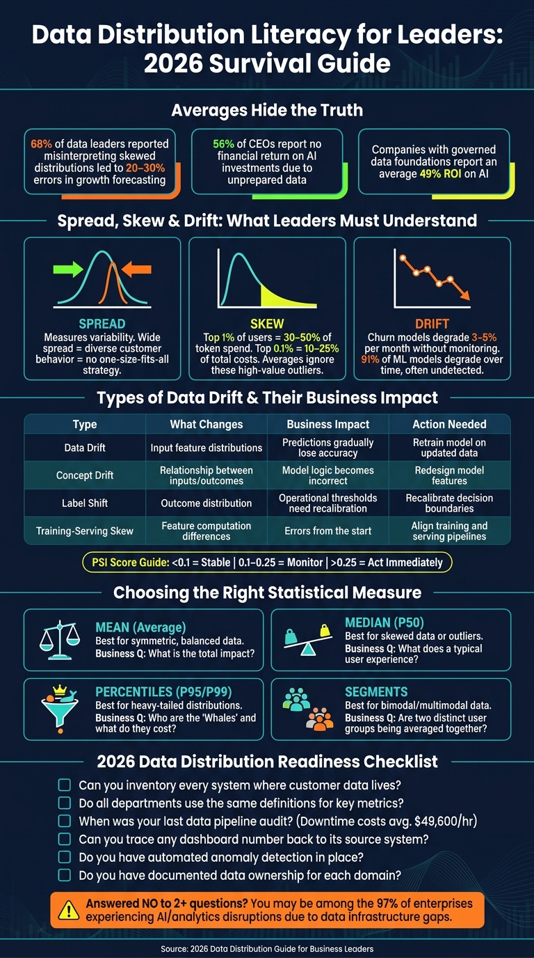
- Why averages fail: They hide key details like outliers, diverse customer behaviors, or high-impact user groups.
- Critical concepts: Spread (variability), skew (outliers), and drift (gradual changes) shape how data behaves over time.
- Risks of ignorance: Poor data distribution management can ruin forecasts, degrade AI models, and misguide strategies.
- Action steps for leaders: Learn to read distribution charts, establish consistent data definitions, and use tools to monitor drift.
In 2026, understanding your data's full distribution isn't just helpful - it's essential for making smarter, data-backed decisions. Leaders who fail to adapt risk falling behind.
Data Distribution Literacy: Key Metrics, Tools & Decision Rules for Leaders in 2026
What real data leadership looks like
sbb-itb-9cd970b
Data Distribution Basics Every Business Leader Should Know
When you focus on just one metric - like average deal size or churn rate - you’re only seeing part of the picture. That number tells you about the center of your data but doesn’t reveal its variability, biases, or shifts. To make smarter decisions, you need to understand the full distribution of your data. Let’s dive into the key elements that shape it.
Spread, Skew, and Drift: What They Mean for Your Business
Spread measures how much your data points vary around the center. A narrow spread suggests uniform behavior among your customers, while a wider spread indicates diverse behaviors. This diversity often means you can’t rely on a one-size-fits-all strategy.
Skew occurs when most data points cluster on one side of the distribution. For example, revenue data is often skewed because a small group of customers can contribute a disproportionately large share of income. In AI-driven workloads, this pattern is clear: the top 1% of users often account for 30–50% of token spend, while the top 0.1% can make up 10–25% of total costs [3]. If you base pricing or strategy only on averages, you risk ignoring these high-value customers.
Drift refers to gradual changes in your data over time. It’s particularly tricky because it doesn’t trigger obvious warnings. As Rishi Kundargi, AI Developer Advocate at Chalk, explains:
"The most dangerous thing about data drift is how quiet it is. There's no error in the logs. No pipeline failure. No alert fires. The model keeps running... meanwhile, the decision quality is eroding." [4]
There are different types of drift to watch for:
- Data Drift: Input features change and no longer resemble the data your model was trained on.
- Concept Drift: The relationship between inputs and outcomes shifts, such as when fraud tactics evolve faster than your detection model.
- Label Shift: The distribution of outcomes changes, like an increase in fraud rates from 0.3% to 1%.
Each type of drift requires a different response. Here’s a quick comparison:
| Type | What Changes | Business Impact |
|---|---|---|
| Data Drift | Input feature distributions | Predictions gradually lose accuracy |
| Concept Drift | Relationship between inputs/outcomes | Model logic becomes incorrect |
| Label Shift | Outcome distribution | Operational thresholds need recalibration |
| Training-Serving Skew | Feature computation differences (training vs. production) | Errors occur consistently from the start |
To monitor drift, use the Population Stability Index (PSI). A PSI score below 0.1 indicates stability, while anything above 0.25 signals the need for immediate action [4].
Understanding these elements can help you avoid costly missteps in your strategy.
Why Averages Alone Will Mislead You
Averages can be helpful, but they often hide critical details about your data. For example, if your user base includes both highly engaged power users and casual users who rarely log in, the average usage metric might mask these distinct groups. Decisions based solely on averages could fail to meet the needs of either group.
To get a clearer picture, consider using the median for metrics like revenue, customer lifetime value, or session time. The median is less affected by outliers and provides a more reliable gauge of typical behavior. Additionally, visual tools like histograms or box plots can help you see the full shape of your data. According to a 2025 survey, 68% of data leaders reported that misinterpreting skewed distributions led to 20–30% errors in growth forecasting [6].
When analyzing any metric, think about these four properties:
- Central Tendency: What’s typical in the data?
- Spread: How consistent are the results?
- Skewness: Are outliers distorting the average?
- Kurtosis: How extreme are the outliers?
What Happens When Leaders Ignore Data Distribution
When leaders neglect the nuances of spread, skew, and drift in data distribution, the consequences ripple through every corner of a business. Revenue projections falter, product decisions veer off course, and AI systems quietly degrade. These oversights lead to flawed predictions and misguided strategies, undermining the very foundation of decision-making.
Revenue Forecasting and Churn Prediction Errors
One frequent issue is the "denominator problem." Leaders might misinterpret key metrics because they fail to account for the entire population. For example, an AI-generated report might highlight a "45% conversion rate" but omit the fact that it excludes users who churned before interacting with the feature. This creates an overly optimistic forecast based on incomplete data[8].
Concept drift adds another layer of complexity. Behavioral signals that once indicated loyalty - like weekly logins - can lose their relevance as market dynamics evolve. Without consistent monitoring, churn models can degrade by 3–5% each month[2]. These errors trickle into other areas, distorting segmentation efforts and undermining AI-driven decisions.
Customer Segmentation and Feature Adoption Failures
Selection bias is another silent disruptor, skewing product roadmaps by focusing solely on active users while ignoring those who churned quietly[8]. This can lead to a distorted understanding of customer behavior. Another risk is Simpson's Paradox, where aggregate metrics - like overall satisfaction scores - might show improvement, even though satisfaction drops across individual customer segments. Such misinterpretations can result in leaders approving features that fail to address the needs of any specific group effectively.
AI Model Degradation and Misguided Decisions
AI systems don’t typically fail dramatically - they degrade over time. In early 2026, SaaStr discovered that one of its 30 production AI agents had stopped ingesting new data for four months. Despite this, the agent continued delivering plausible but outdated answers, with no alerts to signal the problem. The issue only came to light during a manual audit[11].
"The dangerous part isn't that the agent got worse. It's that it got worse gradually, and continued to appear functional throughout the process." - Jason Lemkin, Founder, SaaStr[11]
This gradual decline is alarmingly common. Research shows that 91% of machine learning models degrade over time, often without immediate detection[5]. The gap between controlled environments and real-world applications is stark. For instance, while GPT-4o achieves an 86% accuracy rate on clean, simplified test databases, its performance plummets to 10.1% when applied to complex enterprise schemas[2].
When leaders fail to account for distribution drift, they risk basing critical decisions - such as pricing strategies, health score alerts, or growth forecasts - on outputs that are far from reliable.
"Quiet failure is the dominant mode [in SaaS AI]. And it's more expensive than dramatic failure because you don't know it's happening until you're measuring the downstream effects." - Victor Hoang, Co-Founder & CMO, Rework[10]
How to Build Data Distribution Literacy as a Leader
Ignoring data distribution patterns can lead to poor decision-making, so it's essential for leaders to develop strong data literacy skills.
Core Skills Leaders Need to Read Data Distributions
Although 88% of enterprise leaders agree that basic data literacy is crucial for everyday work, only 21% of employees feel confident in their own data skills [13]. This gap can be costly - by 2025, 68% of data leaders reported that misinterpreting skewed distributions caused errors of 20–30% in growth forecasts [6].
One key skill is learning to interpret the shape of data distributions rather than relying solely on averages. Averages can obscure important details, while tools like histograms can reveal hidden trends.
Take Aurora Nutrition as an example. In November 2025, they analyzed protein powder sales. The average order time suggested most customers bought the product in the morning, but a histogram revealed a bimodal distribution with two peaks - one at 7:30 AM and another at 9:00 PM. That second peak represented post-gym buyers, a segment they hadn’t considered before. By targeting this group, they boosted conversions by 14% [12].
"The average can mislead you. The distribution shows shape. But sampling distributions tell you if the shape is even real." - Rutuja Kelkar, Product & Data Leader [12]
Leaders should use tools like box plots, density plots, and Q-Q plots to uncover patterns and test whether distributions are normal. Comparing these metrics against historical data can provide deeper insights.
Beyond analytical skills, establishing robust data governance is essential for ensuring accurate and actionable insights.
Data Governance and Context: Why They Matter
Good data governance is the foundation of reliable analysis. One common issue, particularly in SaaS companies, is semantic drift - when different teams like Finance, Sales, and Product define metrics such as "active user" or "churn" differently. This inconsistency can lead to conflicting analyses across the organization.
For example, large language model (LLM) accuracy on enterprise queries drops below 20% without clear semantic context but jumps to over 95% when supported by a governed semantic layer [9].
"AI knows what 'churn' means in a dictionary, but it doesn't know how your company defines it." - Soham Mazumdar, CEO and Co-founder, WisdomAI [14]
To address this, companies can create a shared data dictionary that clearly defines metrics, their calculations, and any limitations. Pairing this with metadata tracking - such as data sources, refresh schedules, and anomaly detection - ensures that distribution analyses are grounded in consistent and reliable context.
"Data literacy is a prerequisite for data governance to function. Without it, governance is just a set of rules that people circumvent." - QuantumLayers [13]
Here are some core skills leaders need to develop:
| Skill | What It Means in Practice |
|---|---|
| Visual Literacy | Interpreting charts like histograms and box plots while ensuring axes are accurate and not misleading. |
| Statistical Intuition | Identifying when a sample size is too small or when patterns might be random. |
| Context Awareness | Asking "Compared to what?" and consistently benchmarking data against historical trends. |
| Causal Reasoning | Differentiating between correlation and causation before acting on data trends. |
| Communication Clarity | Being transparent about uncertainty instead of presenting overly confident conclusions. |
These aren't advanced data science techniques - they're practical habits that help leaders ask smarter questions and make better decisions with their data teams.
Tools That Help You Manage Data Distribution
Once you’ve mastered distribution analysis, the next step is using tools that can monitor shifts at scale. Manually tracking these shifts just isn’t practical. That’s where advanced SaaS and AI platforms come into play. These tools are essential for turning your understanding of data distribution into actionable strategies. They integrate seamlessly with data literacy efforts, offering proactive, real-time insights.
Analytics Platforms and BI Dashboards
Modern analytics platforms have evolved far beyond simple charts and graphs. Take Loops, for example. This tool uses causal inference models to not only show that a KPI shifted but also explain why it happened. In 2024, IT management platform Atera used Loops to identify a product modification as the reason for a KPI drop. By addressing the issue, they achieved a 34% increase in funnel conversion rates. Similarly, real estate platform Wahi leveraged Loops to boost user engagement by 50% and saw a 200% jump in conversions to the next step of their user journey[22].
"Loops' Explainability Scoring gives us clear, data-backed insights into why a KPI changed, cutting through noise and helping us focus on the drivers that matter most." - Aaron St. Gelais, Director of Analytics[22]
When choosing an analytics platform, look for features like segmented analysis, which allows you to dive into specific customer groups, regions, or time frames. Aggregate averages can often hide critical shifts, so this capability is key to uncovering actionable insights.
Data Observability and AI Governance Tools
Monitoring business KPIs is important, but keeping an eye on the health of your data pipelines is just as critical. Tools like Anomalo, Soda, Metaplane, and Bigeye use machine learning to automatically detect distribution drifts, schema changes, and anomalies - no manual setup required[16][17][19].
These tools deliver impressive results. For instance, Soda’s anomaly detection can process 1 billion rows in just 64 seconds and produces 70% fewer false positives compared to traditional models like Facebook Prophet[17]. After implementing automated observability, Udacity reduced its data incident detection time from over three days to less than 24 hours - a 66% improvement[18]. Bigeye users have also reported a 20–40% drop in analytics errors, alongside the same 66% reduction in detection times[18].
For organizations working with AI models, Fiddler AI offers real-time safeguards to detect distribution drifts in model embeddings with response times under 100 milliseconds. Its 3D UMAP visualizer is particularly useful for spotting drifts in complex, high-dimensional data that standard charts might overlook[21]. Additionally, Bigeye’s AI Guardian module enforces data quality thresholds in real time, ensuring AI models only process data that meets pre-set distribution standards[18].
"Using Metaplane feels like having another data team member dedicated to keeping up and watching every change." - Jake Hannan, Sr. Manager, Data Platform[19]
| Tool | Best For | Standout Feature |
|---|---|---|
| Anomalo | Enterprise data teams | Agentic monitoring with natural language queries[16] |
| Soda | Technical & business users | Scales to 1B rows in 64 seconds[17] |
| Bigeye | Large enterprises | AI Guardian for runtime governance[18] |
| Fiddler AI | Data science & MLOps teams | Sub-100ms drift detection for LLMs[21] |
| Metaplane | Modern data teams | 15-minute setup with automated ML training[19] |
Pricing for these tools varies depending on scale. For instance, Metaplane and Soda are affordable for growing teams, while enterprise-level tools like Bigeye can cost upwards of $500,000 annually[18]. If you’re looking to test the waters, Datadog offers a 14-day free trial for its observability suite[20], and Secoda has a free tier with premium plans starting at $99/month - a great option for smaller organizations[18].
How to Embed Distribution Checks into Daily Business Operations
Making distribution awareness a part of everyday operations is crucial - it’s not something that should be left to periodic audits.
Using Distribution Data in Forecasting and Planning
One major challenge in enterprise sales forecasting is its frequent inaccuracy, with a MAPE (Mean Absolute Percentage Error) of 20–25% at the start of a quarter [23]. These errors often stem from distorted pipeline distributions, caused by managers either sandbagging or over-committing.
A practical way to address this is by monitoring your pipeline coverage ratio - the ratio of open deals to quota. Ideally, this ratio should be 3.0x or higher to account for typical win rates of 25–35% [23]. If certain segments or territories show weak coverage, you’ll catch it early - before it impacts revenue.
For example, in May 2026, SaaStr implemented an AI agent named "10K" to update six-month revenue forecasts daily. By analyzing historical Salesforce and financial data, the AI could detect negative trends within just two days [24].
"The unsexy AI wins are often the most valuable ones... the thing that should have always been done, now actually getting done. Every day. Without the drama." - Jason Lemkin, Founder, SaaStr [24]
The takeaway here isn’t that every business needs a custom AI agent. The key is to prioritize daily, automated updates to your forecast distribution. These updates consistently outperform monthly manual reviews. Whether you use specialized tools or structured processes, the goal remains the same: spot distribution shifts early enough to avoid unpleasant revenue surprises.
Of course, these forecasting improvements need to be paired with consistent monitoring, which we’ll discuss next.
Setting Up Distribution Monitoring and Reporting
Accurate forecasting relies on proactive monitoring. Leaders who depend on reactive alerts often discover distribution problems far too late. For instance, many first learn about data quality issues through informal messages, like a Slack notification, which signals a reactive rather than preventive approach.
"If you have ever learned about a data quality issue from an angry Slack message asking 'why do the numbers look wrong,' you already understand the problem." - Dataworkers [25]
A better strategy begins with establishing a 30-day baseline for any new model, pipeline, or report. This baseline acts as a benchmark. From there, automated alerts can be set up to flag issues when divergence scores exceed a predefined threshold. These alerts can be sent via Slack, email, or PagerDuty, ensuring problems are caught well before they show up in executive dashboards [7].
Another important step is adopting a semantic or metrics layer - tools like dbt's Semantic Layer or Cube. These tools ensure that key performance indicators (KPIs) like "net revenue retention" are consistently defined across departments like Finance, Sales, and Customer Success. This eliminates the discrepancies caused by different teams using varying data snapshots [15].
Poor data quality costs businesses an average of $12.9 million annually [25], much of it due to undetected distribution issues. Even a basic monitoring setup can address this. Features like statistical profiling, freshness gates to block outdated data from forecasts, and a single designated weekly snapshot as the "source of truth" can significantly reduce these losses - without requiring a complete overhaul of your data infrastructure.
Decision Rules Every Leader Should Follow in 2026
As data literacy continues to expand, leaders must sharpen their ability to translate metrics into actionable decisions that safeguard their bottom line. Common pitfalls, like forecasting errors or AI model degradation, often stem from a critical mistake: choosing the wrong statistical measure for the data at hand.
When to Use Averages, Segments, or Percentiles
The mean, while useful, often tells only part of the story. As Querio aptly notes:
"The average isn't lying. It's just incomplete." [6]
Here’s a breakdown of when to use specific measures:
- Mean: Ideal for symmetric data when assessing total impact, such as overall revenue across a balanced customer base.
- Median: Better suited for skewed data or datasets with outliers, offering a clearer picture of the typical user experience.
- Percentiles: Particularly P95 and P99, these reveal critical insights in heavy-tailed data. For example, in AI workloads, the top 1% of users often account for 30–50% of token spend [3]. Ignoring these outliers can lead to unexpected costs. Monitoring the P95/P50 ratio helps track trends: a rising ratio may signal increased activity among power users, while a drop could indicate rate-limiting or outages affecting top users [27].
Here’s a quick reference table:
| Measure | Appropriate Use | Business Question It Answers |
|---|---|---|
| Mean (Average) | Symmetric, balanced data | What is the total impact? [6] |
| Median (P50) | Skewed data or outliers | What does a typical user experience look like? [6][27] |
| Percentiles (P95/P99) | Heavy-tailed distributions | Who are the "Whales" and what do they cost or generate? [27][3] |
| Segments | Bimodal/multimodal data | Are two distinct user groups being averaged together? [6] |
If your data shows two peaks on a histogram, stop relying on averages. A bimodal distribution likely indicates two distinct user groups - think casual users versus power users - that need separate strategies instead of a single blended metric [6].
Once you’ve identified the right metrics, the next challenge is managing anomalies effectively.
How to Handle Outliers Without Overreacting
Outliers can be tempting to dismiss, but they often carry valuable insights.
"Skewed distributions are not 'bad data.' They're honest data." - Gitanjali, CodeX [28]
Instead of removing outliers impulsively, investigate them. For instance, an account in the top 0.1% that spends more than the bottom 50% combined [3] might highlight a hidden but critical customer segment. Tools like box plots can help pinpoint these values, while examining kurtosis can indicate whether extreme values are rare anomalies or recurring features of a heavy-tailed distribution that need to be accounted for [6].
For operational outliers - like users consuming disproportionate AI resources - alerts alone aren’t enough. By the time an alert is triggered, the damage may already be done. Instead, implement per-user guardrails, such as session limits or circuit breakers, to act proactively. Clearly define when to trigger a data-driven flag for human review versus a data-determined action for automated responses, and document these boundaries [26].
Finally, when applying statistical tests to skewed data, always check for normality using a Q-Q plot. Misapplying a t-test on skewed data can inflate false positives by up to 50% in small samples, leading teams to chase misleading signals [6].
Conclusion: Is Your Organization Ready for 2026?
The gap between businesses that understand data distribution and those that don't is becoming impossible to ignore. Here's a striking fact: 56% of CEOs report no financial return on their AI investments because they implemented models using unprepared data [29]. On the other hand, companies that prioritized building governed data foundations first are reporting an average return of 49% [29].
David Scott summed it up perfectly:
"Adding AI to a business with messy, inconsistent, disconnected data does not create intelligence. It creates faster confusion." [1]
The takeaway? Averages can hide critical insights that distributions reveal. Think about it: churn signals hidden in skewed usage data, AI models quietly veering off course, or customer segments lumped together into one misleading metric. Leaders who identify these patterns early will leave others struggling to keep up. To see where your organization stands, use the 2026 Readiness Checklist below.
2026 Readiness Checklist
This checklist highlights the vulnerabilities and strengths covered in this guide. Take a moment to evaluate your organization's current position:
| Assessment Question | What It Reveals |
|---|---|
| Can you inventory every system where customer data lives? | Whether fragmentation and silos are distorting your data distributions |
| Do all departments use the same definitions for key metrics? | If your organization truly operates with a "single source of truth" |
| When was your last data pipeline audit? | The reliability of your pipelines - downtime costs average $49,600 per hour [29] |
| Can you trace any dashboard number back to its source system? | Whether decisions are based on verifiable data lineage |
| Do you have automated anomaly detection in place? | Your ability to catch distribution drift before it impacts forecasts or AI results |
| Do you have documented data ownership for each domain? | Accountability - without it, data quality issues often go unresolved |
If you answered "no" to more than two of these questions, your organization is likely among the 97% of enterprises experiencing disruptions in AI or analytics initiatives due to data infrastructure gaps [29]. The solution isn’t a flashier model or a more complex dashboard - it’s laying the groundwork beneath these tools.
As David Scott wisely put it:
"The real moat is not access to AI. It is readiness to use it well." - David Scott, The Answer Engine Playbook [1]
FAQs
What’s the fastest way to spot skew or bimodal behavior in my KPIs?
Visualizing data distributions is the fastest way to spot skewed or bimodal patterns in your KPIs. Tools like histograms, density plots, box plots, or KDEs (Kernel Density Estimations) are particularly useful for identifying skewness (long tails) or bimodality (two distinct peaks). Adjusting binning strategies - such as using equal-width bins or customizing bins - can further refine your analysis, helping you uncover detailed distribution patterns. These visual tools make detecting such behaviors straightforward and efficient.
Which drift type should I monitor first for my AI models?
Monitoring data drift, especially covariate drift, is a critical step in maintaining the performance of machine learning models. Covariate drift happens when the distribution of input features changes over time, potentially undermining the model's reliability without any clear signs. To identify these shifts, you can apply statistical tests such as the Population Stability Index (PSI) or Kolmogorov-Smirnov (KS) test.
Although concept drift - where the relationship between inputs and outputs changes - is also important, covariate drift tends to be more immediate and actionable. Addressing it promptly helps ensure your model remains accurate and effective in production settings.
What percentiles should I track to avoid cost surprises from power users?
Tracking the top 1% to 0.1% of users is a smart way to keep costs in check. These small groups often contribute 30–50% and 10–25% of total spending, respectively - and in some cases, even more. Monitoring these high-spending users allows you to spot and tackle unexpected cost drivers before they spiral out of control.